Tuesday 15 November 2011

Evaluation Q1 - In what ways does your media product use, develop or challenge forms and conventions of real media products?

When producing our music video the editing was very important to us as it is in every music video. We met the typical convention of a music video by using fast cuts as it was suitable to our indie-rock theme. By using many different fast shots, this meant that it would keep the audience interested and as Pete Fraser says it makes it impossible to grasp on the first viewing which ensures multiple viewings. When the shots of Jono are on screen the cuts between shots are very fast which helps to keep up tempo with the music in the background. We decided that we would play around with the white balance and contrasts to enhance the quality and offer different kinds of pleasure for the audience. The quality is enhanced as it looks much more professional as it no longer looks simple and less boring. Another effect which we decided to use was rounding the edges on the shots of Jono. This creates a much warmer effect for the music video which is well suited to the warmth which had also been created from the change in contrast. As you can see in the Arctic Monkeys music video below they have played round with the contrasts to make the music video more interesting. As the contrasts of the music video have been changed, it makes it much harder to see the bands faces. This creates a sense of mystery for the viewer and normally when you cannot see something you would go back and watch it again which produces more viewings for the band. 


We hinted towards voyeurism when using Daisy in the shots of her and Jono going up the stairs. Immediately, connotations of sex has been displayed.


 By using Chris there is also potential for response from women. He is very muscular and by using a visually pleasing male as the singer it could make women want to watch the music video more as they are attracted to them although, the attraction towards the male could lessen once they get to a certain size. 


When we were recording our music video we took Goodwin's music video analysis into view. Goodwin said that particular music genres can have their own music video style and after doing some research, we found that the indie-rock genre tends to have a mix of narrative and performance. We then decided that we would fit into that genre with our music video which is why we decided to have a narrative and a performance. We also saw that when the indie-rock music video does have a performance that they don't usually have a stage but tend to just use a room of some sort. The Kooks are an indie-rock band and in the music video below they do not use a typical metal stage but just perform in a simple, plain room. 


After researching into the settings of the indie-rock genre we decided we wanted to record the band in a plain room. After some thought as to where we could find a plain room, we decided that the drama room in school would be very suitable as it also has lighting in there already available to us. The drama room is a plain black room as you can see below.


Once we had moved everything out of the way the black wall created a brilliant backdrop for us as it was plain and a dark atmosphere could be created which would look good with shadows.

The camera work which we used in our music video met many conventions of a music video. We used close ups of the band to create intimacy and a connection between the viewer and the band. When filming we decided that we wanted to have a range of different angles which showed the band. Here is an image of Chris S in the front of the shot, but we can still see Jamie in the background. 


Goodwin also states that there should be a relationship between the lyrics and the visuals. At the beginning of the music video it says 'started off the night' and we see Jono getting ready to go out with his friends. 


There is also another shot of Jono on his mobile ringing his friends which meets the lyrics of 'I asked my friends where should we go?


' When the lyrics 'We have a little dance and I'm sure that I'm in, have a mint night out with a happy ending' we matched the lyrics with multiple shots of Jono and Daisy together, firstly with their arms around each other then there is a shot of them going up the stairs and lastly a shot of Daisy shutting the door behind the two of them. This clearly gives connotations of sexual interactions which fit in with the lyrics of him 'hoping to score'. 


Magazine advert


As I have shown in the above image, I have met many conventions of magazine advertisements in this ancillary text. I have however missed out one main convention of a magazine advert which was the image would normally be of the band. I understand that I have missed out on this but the image of Jono was of a much better quality than the image of the band which is shown below. 


As you can see here, the quality is not at all professional and there is no real connection with the band as no member is even looking at the camera. By using an image of Jono, there is a connection as he is the main actor in the music video and the target audience of young adults can relate to him and his boisterous behaviour in the music video. 

Website


Evaluation Q2 - How effective is the combination of your main product and ancillary texts?

Evaluation Q3 - What have you learnt from your audience feedback?

Celebz Movie
by: kristinalowe2307


Evalution Q4 - How did you use new media technologies in the construction and research, planning and evaluation stages?


Media Evaluation Q4

Saturday 12 November 2011

Final Music Video


New Location
When we originally filmed our music video, the locations were the Manor pub and my (Kristina Lowe's house). The footage which was produced at these locations was not of a professional standard so we decided to re-shoot footage for the video. This involved changing the location. When we filmed Jono getting ready we chose to shoot at his house as it was suitable for a males bedroom and was more realistic than if we were to film in my bedroom again. The other location which we decided to use was our friend Tom Liddington's house. We decided to re-film at his house because we wanted to be able to experiment with the lighting which we were not able to do at The Manor. The shots which have been produced from the re-film are much clearer, well-lit and of a professional standard. 


New Actors
When we received feedback from our first draft, we were advised to use male actors for the narrative instead of a female because it would suit the lyrics of the song much more. Instead of Daisy, we decided to use new actors to hopefully improve our music video. Daisy is still used in our music video, but she is now seen as an extra which is the girl Jonathan will 'pull' in the narrative. We used Jonathan Norton as the main character.


Jono Norton 
Aged 18
Jono's role is to be filmed getting ready for a night out with his 'lad' mates and getting drunk. 
Extras 


Will Norton
Aged 18
Will's role is to be one of Jono's friends in the music video and should be rowdy and getting drunk with him. 


Jack Hodson
Aged 17
Jack's role is the same as Will's. He is one of the lads which is friends with Jono. 


There are also more extras which appear in the music video who do not appear as much including; James Brazier, Lewis Hercek and Charlotte Meadwell. By having many extras in the music video, it makes it seem more realistic that Jono is in a group who are all getting drunk and rowdy with each other. 

Friday 11 November 2011

Final Website


When I got feedback from my first draft I got told that my website was too text heavy and that it should be more visually pleasing. I also used the image which was used on the magazine advert which was very weak. For my second draft I decided to use the magazine advert image because it would produce synergy between the two ancillary texts. The website could promote the magazine advert. I changed the spry menu bar which I originally used on the first draft to images which I produced in fireworks. By producing images this meant that I could change make the menu bar stand out more as on Dreamweaver you can only have one font across the whole page. On the live version of my website when the mouse rolls over on of the menu options the emboss effect on the outside of the text turns purple which would aesthetically please the audience. I changed the font on the final draft also because the original 'Times New Roman' was too boring and plain. As they are an indie-rock band stereotypically they like to stay away from normal and more boring typical fonts.

Final Magazine Advert


This is the original image before I edited it. I edited this image on Fireworks and changed the contrast to make Jono's face stand out much more. I also changed the hue slightly so that  the image seemed much warmer. 


Above is my final magazine advert. I am very happy with my final product as I believe that it gives all the information that the target audience needs to know. I am much happier with the image which has been used as it is of much higher quality as helps to produce links between the music video and the magazine advert as Jono is the main character. I have decided to use black and white fonts because they stand out on the background. When I used colours they did not seem to stand out as well but blend in. I chose this particular image of Jono because I think he looks cheeky and like a typical male which would go out and have fun. He has a smirk on his face and also looks very happy with himself, this creates a slight story as you want to know why he looks that way. By watching the music video, they would be able to realise why he is smirking as its telling his story. I have used the iTunes logo on the magazine advert so that the audience know where to go if they want to buy the album. Ratings on the advert is a typical convention of album advertisements as they want to boast about the ratings they have received in hope the audience will feel enticed into listening. The DropOuts logo which has been used on the website aswell creates some synergy for the band because it is their promotion logo which should eventually be recognised by a large audience. 

Wednesday 19 October 2011

Magazine Draft

Layout
I have decided to use a simple layout which includes putting a large emphasis on the image of the band. The bands logo then stands out next because it is also large. I have centralised all of the text because I believe it looks more aesthetically pleasing and easy to the eye. If the text was all over the place then it wouldn't flow as well as it currently does.

Image
I have only used one image of the band and have decided to put it in the middle of the page. This image was taken when we were filming the band. I believe that an image of the artist on a magazine can help the audience to connect with them. They don't have to create an image of the band in their head because it is already in front of them. I have used stars when Q magazine are talking about the album because it is very stereotypical of magazine adverts.

Font
I chose a simple font for my magazine advertisement because it easy to the eyes and easy to read. Most of the text is black because it contrasts well with the white background. As we go down the page the font gets smaller because it is slowly becoming less important information.

Friday 14 October 2011

First Draft


Construction
The band
When we filmed the band we had to book out our drama room so that we could film in there. We decided to film in the drama room as it is a plain, black room which wouldn't need much re-arranging. We decided that we would go and set up early so that everything was ready for the band when they arrived and so that everything could run smoothly. We had a few problems when using the room but eventually got them sorted but it did take a lot longer than we originally expected. Firstly, when we came to the room we thought that the lighting system would be quite logical and easy to use but when we tried, we had many problems. We did eventually manage to turn them on but it was difficult to figure out at the start. Another problem was that we planned on using Lizzie's phone with an auxiliary cable to play the song into the room through some speakers but the music system which was already in the room did not have an auxiliary plug hole. This meant that we had to burn the music onto a CD instead. The last problem which we came across was when we were filming. As the camera was placed beneath the main light which was aiming straight at the band it kept on overheating so we had to leave it many times to cool down which once again became time consuming. We did eventually manage to get all of the footage which we needed but it took a lot longer than intended. 


Daisy
When we were filming Daisy we did not come across as many problems as we did when filming the band. Everything ran very smoothly but as we filmed at night time the quality of the footage was not coming up brilliantly. We carried on filming as we hoped that at least some of the footage would be usable or could be fixed when editing by experimenting with the lighting options. Unfortunately, as it was so dark outside the footage of Daisy outside became no good to us. The shots in The Manor Pub were also very dark and the quality did not look as professional as the footage of the band. The different between the two was very noticeable. 


The above image is of me filming outside The Manor Pub. 


Feedback
After we had handed in our first draft, the feedback which we were given was that the shots of Daisy were not any good because of the lack of quality. We knew this when we looked back at the footage but at the time had to use what we had. We knew when we re-filmed that we would have to use a better camera and preferably use a HD camera as the quality of the band in HD looked so professional. Another criticism that we were given was that the footage of Daisy did not seem to fit very well with the lyrics of the song. As the song is about a group of boys getting drunk and having a good time, we decided that when we re-filmed that we would use male actors instead. When we got feedback about the footage of the band, it was all very positive. I have learnt from this filming that we shall have to make sure it is the right time of day when we re-film because we cannot lose any more time due to lighting problems. 

Tuesday 27 September 2011

Logo Ideas

A logo is a graphical representation or symbol of a company name. A logo allows people to recognise the company, in our case a band and defines in from others. A logo would be used on the digipack, on a website and in any advertisements. 

Our logo ideas for 'Drop Out' include:


We have chosen to go for a strong, bold title, in black and white. We like the black and white titles as they are simplistic and minimal which will stand out against photographs etc. After looking at the four font styles we have decided to use the following font: 


Wednesday 21 September 2011

Mock up of Website Homepage


Layout
When I have researched into similar artists websites I have realised that they have links which go to other pages and on the main page they like to give the fans information or 'latest news'. I have decided to use the following layout on the homepage as it advertises the most important factors. The other links at the top are also informative but if a fan was to want important information it should be able to be found on the homepage. 


Colour
I have decided that the background is going to be white and the font is going to be simple and black. I have chosen these colours because I have found from my research that black and white are the main colours which are used. I think that by using black and white it will look professional. 


Image
I intend on having an image of the logo in the top left hand corner. This will be done to define the band and so that when people see the logo they will know automatically who it is. I would like to have the music video underneath the navigation bar and then another image of the band somewhere on the page. 


Font
For the website I would like to use quite a simple font so that I can keep it looking quite professional. A font such as Cambria or Georgia will most likely be used. If it is easy to read then my audience will be able to find what they want easily. 

Props Preparation

Band
For the band, we will need a few props to make the band performance seem real and so that they can perform, they will need the following;

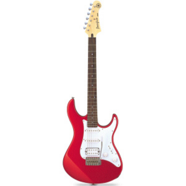
Lead guitar,
Drums,
Microphone,
Amplifiers


Daisy
So we can make Daisy look like a disgrace we will need to add some props into our performance such as;
Alcohol,
(what looks like) Drugs,
Glasses (wine),
Beer bottles,
Cigarettes


Costume Planning

The Band

The band should be wearing casual clothing which isn't out of the norm such as;


Printed t-shirts as shown above are not out of the norm for the type of indie band we have decided to use. If the band were to wear jeans with this sort of t-shirt it would create the image which we would like for our performance.

Daisy
We would like Daisy to wear a dress when following her narrative. We need her to stand out from everyone else so we woul like her to be quite made up. Her hair, make-up and clothing should be very exaggerated at the beginning of the video and to show the contrast at the end her make-up and hair should be messy. This will show that she has been acting a disgrace.

Actor/Character Profile


Daisy Ashmore


Daisy Ashmore is going to be playing our main character in the narrative part of the music video. She is 18 years old and will be acting as the 'disgrace'.
She will be seen taking drugs, drinking alcohol and smoking. 


Chris Tye

Chris Tye is going to be playing the lead guitarist in the performance part of the music video. He is 22 years old and was one of the main participants towards producing the song 'Actin' a Disgrace'.


Jamie Bostock
Jamie Bostock is going to be playing the drums in the performance part of the music video. He is 21 years old.


Chris Swann


Chris Swann is going to be acting as the main singer in the performance part of the music video. He is 22 years old.   

Video Location

The Drama Room
The drama room is going to be used for the performance parts of our music video. As the room is plain and dark we felt that it was a good setting which was easily accessed within the school and suitable for the imagery we want to create. Lighting is available in the drama room and we will be able to get the spotlight onto the band just as we would like to. 


The Manor Pub
In the music video, this will be Daisy's local and she will be seen drinking in the pub before she goes out for the night to clubs. She will be drinking and spending a lot of money in the pub and will then later on be seen stumbling out of the pub on her way out for the rest of the night. This will portray her as 'actin' a disgrace'.


My Bedroom
My bedroom will only be used for a few shots which will show Daisy getting ready to go out for the night. It will also be used for when she comes home and collapses at the end of the night. We will also show another shot of her stumbling up my stairs drunk as she comes up towards the bedroom. 


Camera Angles and Shots

Close up


This photo is an example of a close up. We intend on using quite a few close up shots within our music video because they allow the audience to connect with the characters and band as they can sense their emotions.

Lyrics

Actin' a Disgrace


Had a bit much, you best slow down,
That's what people say when I'm drinking in town,
They think I'm a prat, I'm actin' all that, 
But I know I can handle it I said it that's that,
And through all of this, they say I won't learn. 
But who really cares mate.
Lets be fair you only live once, 
Started off the night, had a few brews, 
Wasn't too sure what we should do. 
Got a bit smashed, spent a bit of cash, 
Just feelin' a little bit jolly.
I asked my mates, where should be go? 
Didn't surprise me when they said they didn't know, 
So to save the night, ordered a round of shots, 
One, two, down the whole lot, 
The nights coming on, the drinks coming thick,
My mate runs to the toilet cause he said he felt sick,
All the ladies are laughing, takin' the mick,
Time to move on out the club I think. 
So we get lairy, down to the next but the doormans there,
Let us in mate, but we had no luck, 
Cause we argued a bit then my face got torn.


Chorus
Keep yourself at that pace mate .............
Keep on drinking at this rate, you're gonna be out of your face,
Keep yourself on that pace mate, you're actin' like a disgrace
Keep on drinking at this rate, you better get out of this place. 


I feel a bit woozy, shouldn't really rush it, 
Asked for another but I didn't want to push it,
Who cares what she thought, it's what I think, 
I'll have a few more pints and i'll buy you a drink.
All the last rounds were my last bit of money, 
Blokes at the back kept looking at me funny.
In my own little world, here on the floor, 
Dancing like a prat and I'm hoping to score.
Finally i've been approached, a fit lass steps up with her hair in a broach
We have a little dance, and I'm sure that I'm in, 
Have a mint night out with a happy ending.
I go for a kiss, have a bit of a shock, 
a neat head grabs me, built like a rock.
Tried to explain the best that I can, 
But he cut me off short with his right hand. 


Chorus
Keep yourself at that pace mate ..........
Keep on drinking at this rate, you're gonna be out of your face, 
Keep yourself on that pace mate, you're actin' like a disgrace
Keep on drinking at this rate, you better get out of this place.


Mate your round
You're up
Well I could buy this guy a gin
I could buy my other mates a gin, 
The fact of the matter is, if I buy these guys a drink, 
I won't be able to get home, I don't know what to do with myself.
You need to sort it out man, taxis these days cost an absolute arm and a leg.
Have you seen the state of the state of that bird over there?
Mate, she is absolutely out of it. Mate, she looks manlier than him, he needs to sort her out.
Sort it out mate, she's actin' like a disgrace.


Chorus
Keep yourself at that pace mate ..........
Keep on drinking at this rate, you're gonna be out of your face,
Keep yourself on that pace mate, you're actin' like a disgrace.
Keep on drinking at this rate, you better get out of this place.


Keep yourself at that pace mate ..........
Keep on drinking at this rate, you're gonna be out of your face, 
Keep yourself on that pace mate, you're actin' like a disgrace. 
Keep on drinking at this rate, you better get out of this place.


Keep yourself at that pace mate ..........
Keep on drinking at this rate, you're gonna be out of your face.


Permission

Location Permission


Shooting Schedule


Risk Assessment

Safety is very important when filming, so I have created a risk assessment so that I am aware of the possible risks.


What is the risk?
Who/What is at risk?
What is the risk level?
What am I going to do to prevent the risk?
Dropping or damaging the camera
The camera
Medium/High
To make sure that I do not drop the camera I will make sure that the camera is securely screwed onto the tripod at all times. When the camera is not being used I shall make sure it is in its case.
Losing equipment
The equipment
Low
The props which are being used are quite large and should not be lost easily. When the filming is finished I shall check that all the equipment used at the beginning is still with us at the end.
Damaging equipment
The equipment
Low/
Medium
Unless we are being careless or an accident happens the risk of damaging the equipment should be low because we should be being responsible with our possessions.
Breaking the tripod during filming
The tripod
Low
The tripod which I am using should not break as it is reasonably new and in good condition. I will make sure that when I use it that it is being used correctly.

Storyboard

Treatment


Brainstorming

Research into Websites

Research into Digipaks

A digipak is a patented style of CD packaging and is a registered trademark of AGI World Ltd, which is an Atlas Holdings company. Digipaks typically consist of a gatefold (book-style) paperboard or card stock outer binding, with one or more plastic trays capable of holding a CD or DVD attached to the inside. Digipaks were among the first alternatives to jewel cases to be used by major record companies.


Historically, Digipak was only available in large quantities. However, AGI has recently introduced a new product called digipak i-create for the consumer market. Digipak i-create is a web-supported concept that is aimed at music, photo and creative markets.


Digipaks normally only have two fonts which are simple and of a sans serif type to make sure everything is easy to read and not too complicated on the page. Similar images are used on the front and back to establish a theme and keep everything together. A large font is normally used on the front page to show the bands name and make sure that they can be defined in the future. Often for the indie genre, not a lot of colour is used because they want the focus to be on the image. 


Kooks Inside in - Inside Out Album Cover
inside+out.bmp.jpg


This is an example of The Kooks 'Inside In, Inside Out' album cover and back. The design which The Kooks have decided to go for is very simple. They have used a red font to make the album name stand out against the rest of the page which is black and white. They have decided to use an image of the band themselves on the front and back pages which helps you to feel a connection with them. This is a similar idea to what we would like to produce for out band 'Drop Out'. 

Interesting Videos

Two Door Cinema Club - Undercover Martyn


When I first saw this music video, I was amazed with what they had managed to do. The three members of the band are being held up by people dressed in all black suits and being filmed from what would be the ceiling. This music video must have been very cheap to make and although it is very simple, it is fun and I could watch this video many different times. Some fast straight cuts have been used in this music video and I think that it is something I will use within my music video because it keeps me, the viewer on edge and it makes me want to see everything which is happening. I am fascinated in the simplicity of this music video but how fun it has managed to be.

Ed Sheeran - You Need Me, I Don't Need You


This music video features a male character doing sign language to all of the lyrics throughout the video. I think that the way the music video has been edited to be in black and white creates a good image as I think it looks more dramatic especially when combined with the lighting. The lighting which has been used is done very well due to the way it goes a long with the backing beat. Fast editing has also been used in this music video as most shots change on the harsher notes in the song.
Music Video Analysis: 'What You Know' by Two Door Cinema Club

Two Door Cinema Club are an indie rock band from Northern Ireland. They formed in 2007 and have only began to recently make it onto the television and radio. The band is composed of band members: Sam Halliday, Alex Trimble and Kevin Baird. They are signed to French record label Kitsuné.


Camerawork
As in most music videos, the camerawork which has been used uses the conventional shots; long shot, mid shot, close up, extreme close up, tracking shots and pan shots. The video starts with a close up of the dancers feets and gradually zooms out to track a long shot of all the dancers in a line. Tracking shots are used regularly within this music video as the camera is trying to follow the dancers movements.

The band are constantly in the background playing their instruments, so the video is mainly performance. Below is the band playing in the video;

Editing
Similarly to blink-182's 'What's My Age Again' video, continuous editing is used throughout. This will be once again because it is the easiest option and straight cuts go well with the song because it is fast and upbeat. Transitions could slow down the pace of the video and I don't think that they would suit this song. The straight cuts go well the pace and lyrics. Towards the end of the video, CGI has been used which creates a good, different vibe for the video. On a black background, one shot has been taken but has been repeated many different times and each time delayed a little bit. Each cartwheel is in a different colour and it creates a good effect.


Mise en scene
Costume will have definitely been thought about in this video. Each member of the band is wearing clothing which would typically worn by the 'indie' genre. This is also something which helps you to define them into the 'indie' genre. The location which is being used is just a large white room which isn't necessarily typical of anything but it shows them well and the dancers have a large space to run around. There are many props which have been used but the main props are the instruments which are being used by the band members.